Activity
What the Activity screen shows
The Activity screen charts what your device reports over time, with totals for the period you pick sitting below the chart. What the chart plots depends on the device: see below. This is activity data, not energy cost. For a day-by-day cost view, see Energy cost.
Find it on the Activity tab in the bottom navigation, or in the sidebar on larger screens.
Choosing a time range

The time range selector sets how much the chart and the summary cover. Pick from eight ranges: 1 hour, 6 hours, 24 hours, 7 days, 30 days, 90 days, 1 year and 5 years. The app remembers your last choice and opens with it next time.
Plan limits apply to the longer ranges:
- The free plan includes ranges up to 7 days.
- The 30-day, 90-day, 1-year and 5-year ranges need Premium.
- Tapping a locked range offers the upgrade without changing your current view.
Reading the chart
There is no fixed set of measurements here. The chart shows whatever your device reports that makes sense to plot over time, so two devices can look quite different.
One chart per kind of reading. The screen gives each kind of reading its own chart, with its own vertical scale. What you see depends on the device:
- A battery might show one chart with up to five power readings, plus a separate chart for its charge level as a percentage.
- A heat pump might show a chart of its temperatures, a chart of its power, and a chart of its coefficient of performance, a measure of how efficiently it is running.
- A hot water store's tank sensor draws up to four lines on one chart, one for each depth in the tank.
Areas and lines. A chart with only one reading is shaded as an area, the way the Activity screen has always looked. A chart with several readings switches to plain lines instead, because several shaded areas stacked on top of each other are hard to tell apart.
Longer ranges average the readings so the shape stays clear. If there is nothing recorded for the period you picked, the chart still shows its time axis, with a note that no data is available. A device that reports nothing chartable at all shows a sentence in place of the chart instead: see the FAQ below.
The totals below the chart
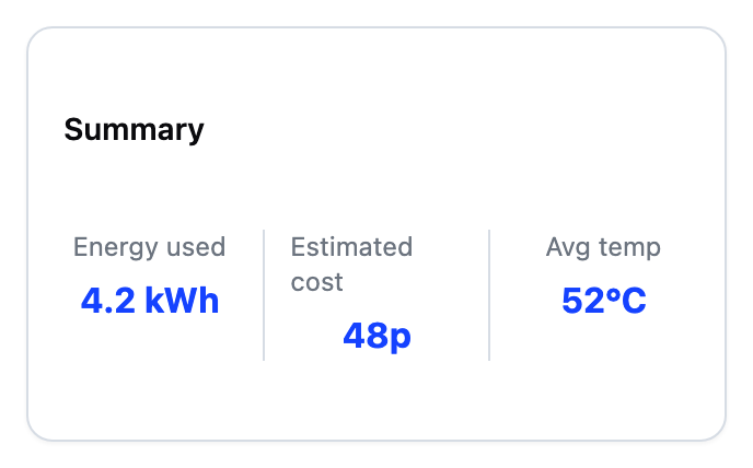
A summary sits below the chart. It shows totals for the selected period: energy used in kWh, estimated cost, and average temperature. Average temperature blends every temperature reading your device sends. A heat pump that reports both a flow and a return temperature gets one combined figure. A device with no temperature reading shows a dash. A dash next to any other figure means data is missing. Missing cost data usually means no tariff is set up. Missing readings usually mean the device was offline.
Frequently asked questions
What if the screen fails to load?
A failed load shows a Retry button. Tap it to fetch the data again. If you see a message that the range needs Premium, your plan's window is shorter than the range you picked. Choose a shorter range, or upgrade from the plan screen.
Why are some time ranges locked?
The free plan covers up to 7 days. The 30-day, 90-day, 1-year and 5-year ranges are part of Premium. Tap a locked range to see the upgrade option.
Why does the chart say no data is available for this period?
This device charts fine, but nothing was recorded for the period you picked. It happens if the device was offline or only recently set up. The time axis stays visible so you can tell which period you are looking at. Try a longer or more recent range.
Why does the screen say this device has nothing to chart?
Some devices do not report anything the app can plot over time. The screen then shows a short message rather than empty axes. This is about the device itself, not the time range you picked, so changing the range will not bring a chart back.
Why are some charts a shaded area and others lines?
A chart with only one reading is shaded as an area. A chart with several readings at once is drawn as plain lines, because several shaded areas stacked together are hard to tell apart.
Why is the estimated cost a dash?
Cost needs both readings and a tariff. If your tariff is not set up yet, add it from the More menu and cost figures appear across the app.